Škoda Auto
How to design a simple and smart solution to boost sales of stock and pre-owned cars?
Marketplace
Full Design Process
Industry:
Automotive
Market:
EU
Client:
Škoda
Year:
2019
Duration:
4 months
My role:
UX Designer
Problem
How do you shift to online car sales when digital vehicle purchases were growing but still far from mainstream?
Business case
Around 20% of the brand's stock cars (5,000 annually) remained unsold in dealerships. The brand's existing stock car marketplace lacked the features and scalability to drive meaningful sales. This led the client to redesign the platform and explore more effective digital sales channels.
Research
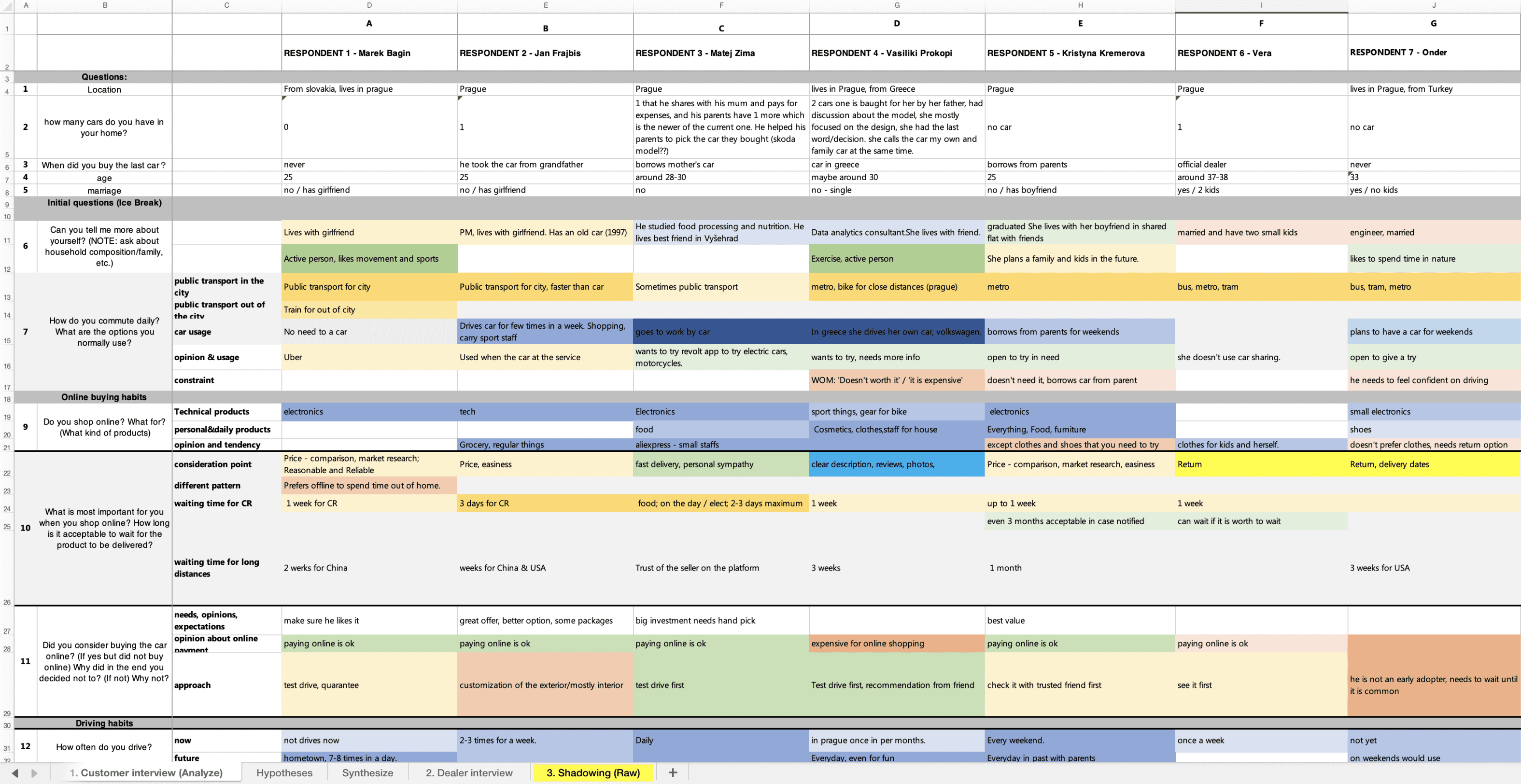
The discovery phase was crucial for our team. Despite facing pushback from the client, we were able to win them over and conduct several key research activities, including:
Content audit and heuristic analysis
Competitive benchmarking
Behavioral data analysis via Google Data Studio
In-depth user research
Dealer shadowing and interviews
Key Findings
Insights from Car Buyers
Through our interviews, we gathered valuable insights into the preferences and behaviors of users when purchasing stock and used cars. These conversations uncovered several important trends that shaped our approach to the platform design.
Key Findings:
Price Sensitivity: Most users favored used cars due to their affordability and established service history, making price a major factor in their decisions.
Stock Car Appeal: Users interested in stock cars were driven by the immediate availability of vehicles and perceived added value, such as warranties or additional features like connectivity.
Trust in Dealerships: Trust in the dealer played a pivotal role in user decisions, with clear communication and transparency throughout the process being critical.
Clarity and Simplicity: Users expressed a need for clear, straightforward information during the purchasing process, especially when comparing stock and used car options.
Test Drives: Many users considered the ability to test drive a crucial part of their decision-making process, particularly when choosing between stock and used cars, as it helped them assess the condition and feel of the vehicle.
Dealers Perspective
Shadowing and in-depth interviews helperd uncover how dealers perceive customer motivations and the challenges they face in guiding customers through the decision-making process.
Key Findings:
Service Complexity: Dealers often highlighted the complexity of managing both stock and used cars, noting that stock cars are primarily attractive due to their immediate availability, while used cars require more in-depth discussions about pricing, history, and service guarantees.
Customer Journey Variability: The journey between initial contact and final decision varied significantly between stock and used cars, with stock car buyers seeking faster processes, while used car buyers required more follow-up and detailed information.
Trust and Transparency: Building trust with customers was emphasized, especially when offering alternatives to their initial preferences (e.g., suggesting a stock car instead of a used one). Clear communication about warranties and add-ons was key in swaying customer decisions.
Feature Importance: Stock car buyers prioritized features like warranties and add-ons (e.g., bike racks or connectivity), while used car buyers focused more on the car’s service history and reliability.
Design Decisions
Here are some examples of design decisions driven by our customer and dealership research findings.
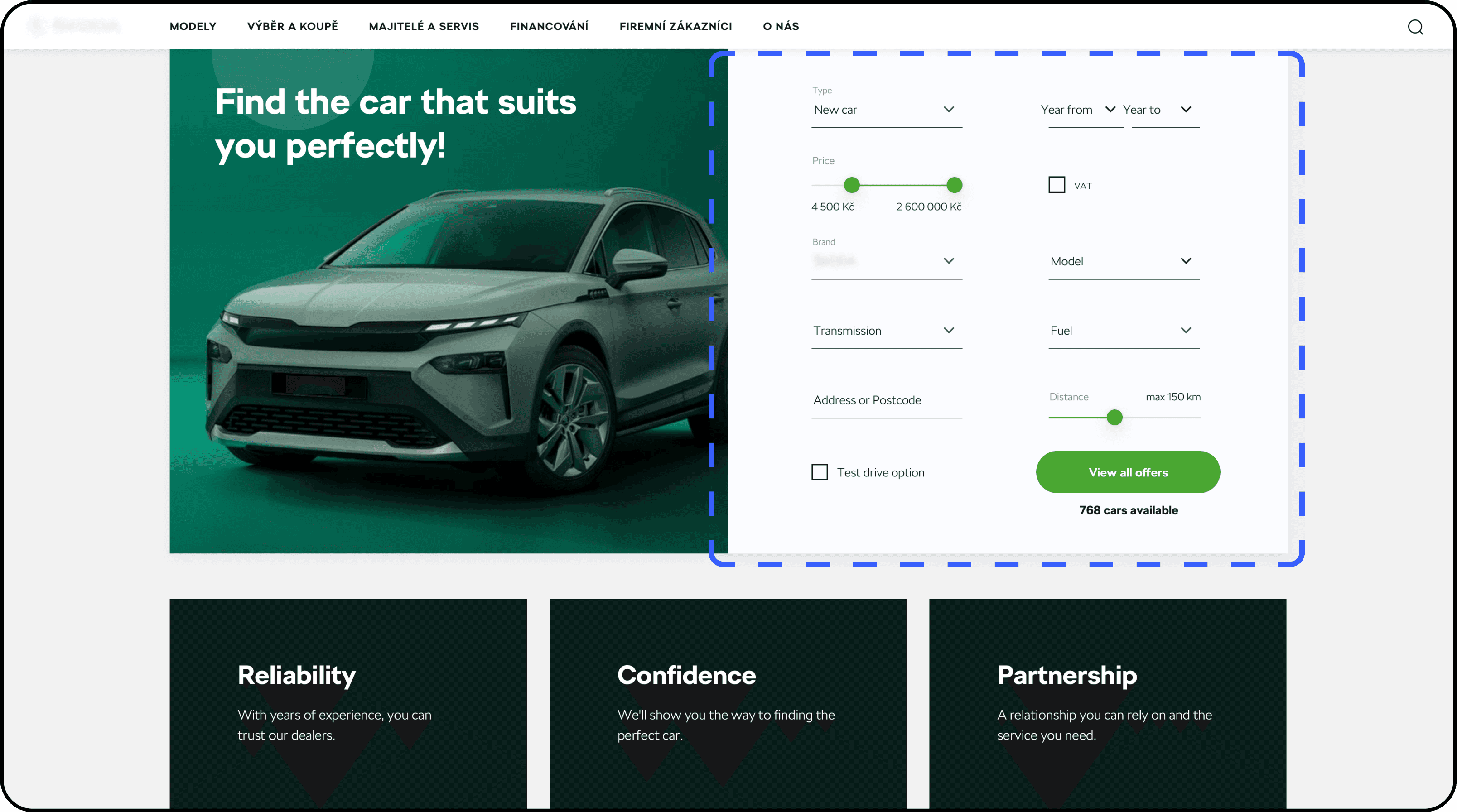
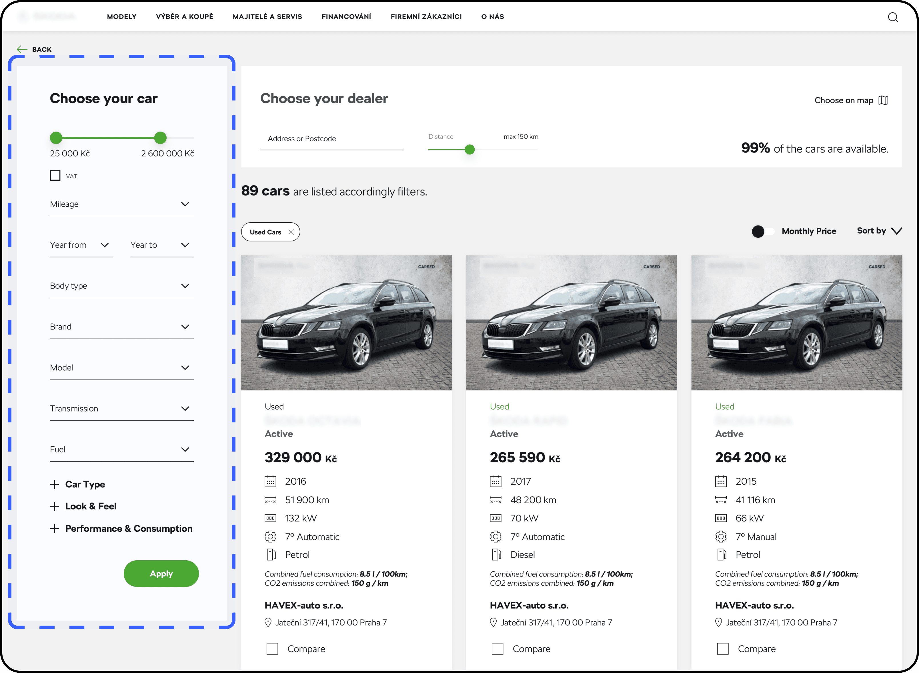
Extensive Search and Filters
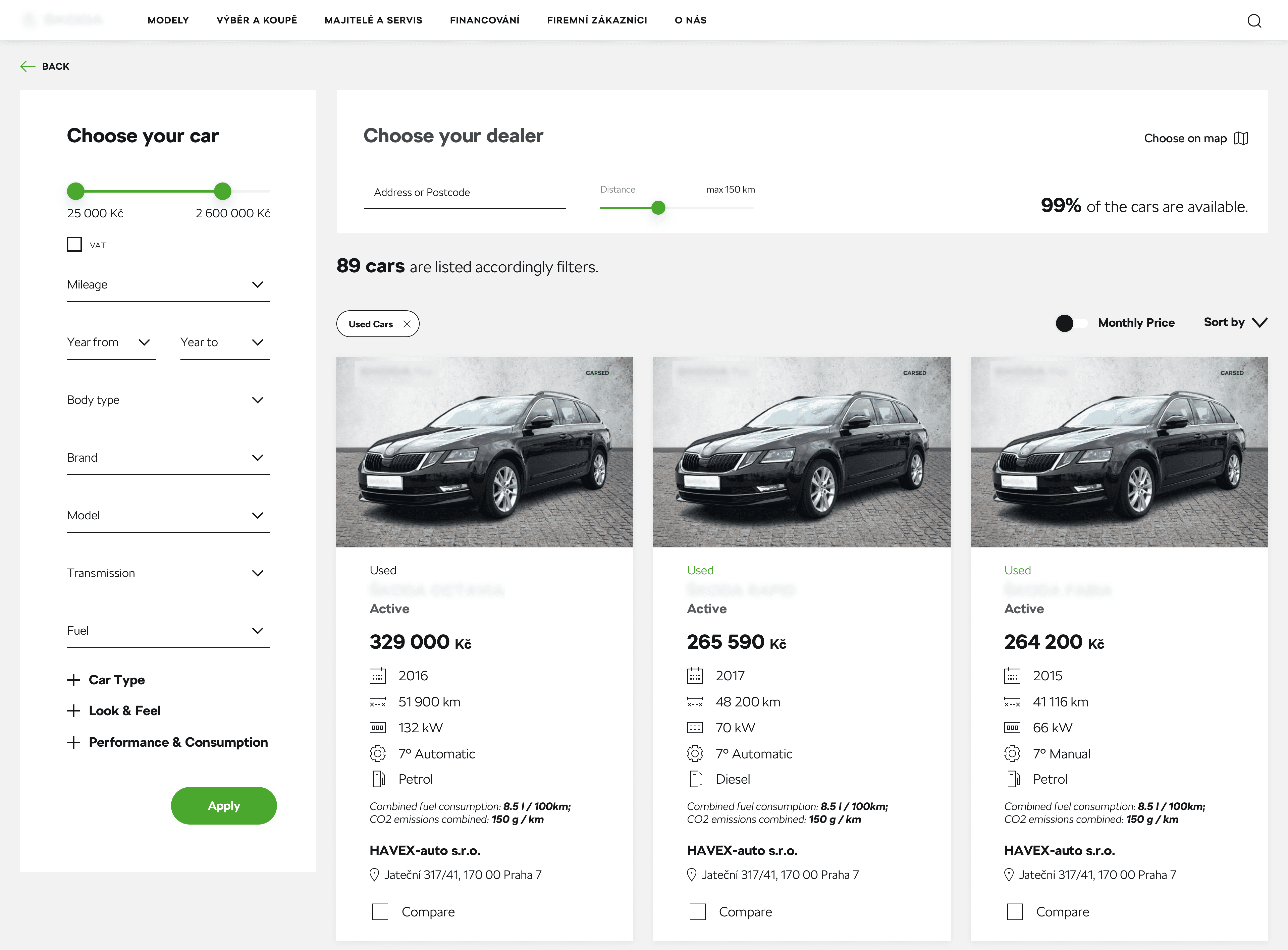
To address users' need for precision when browsing car options, we designed an extensive filtering system. Users often begin with a broad search, then refine by key factors like price, mileage, and features. Providing detailed filters helped them quickly narrow down results
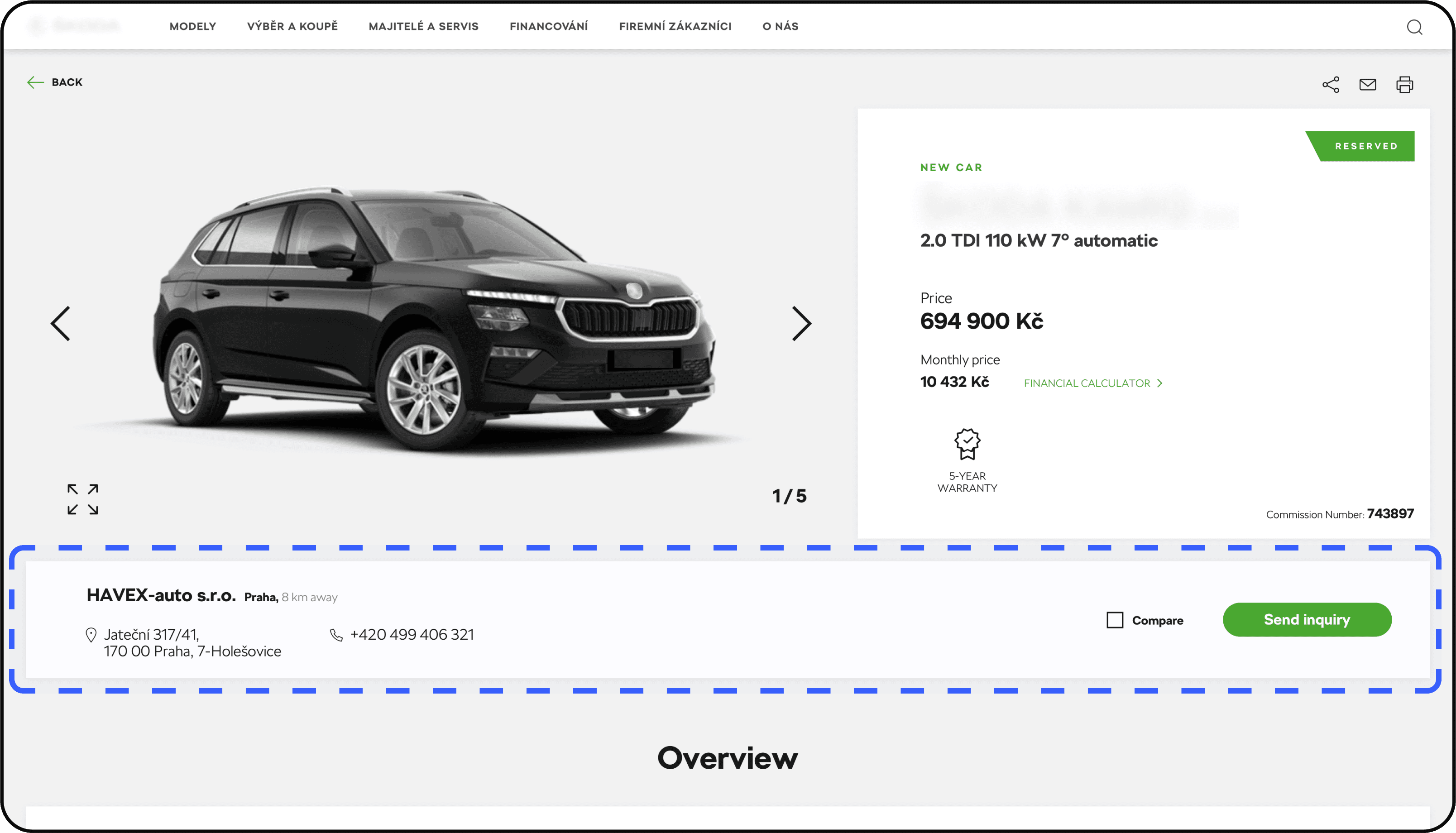
Quick Inquiry for a Test Drive
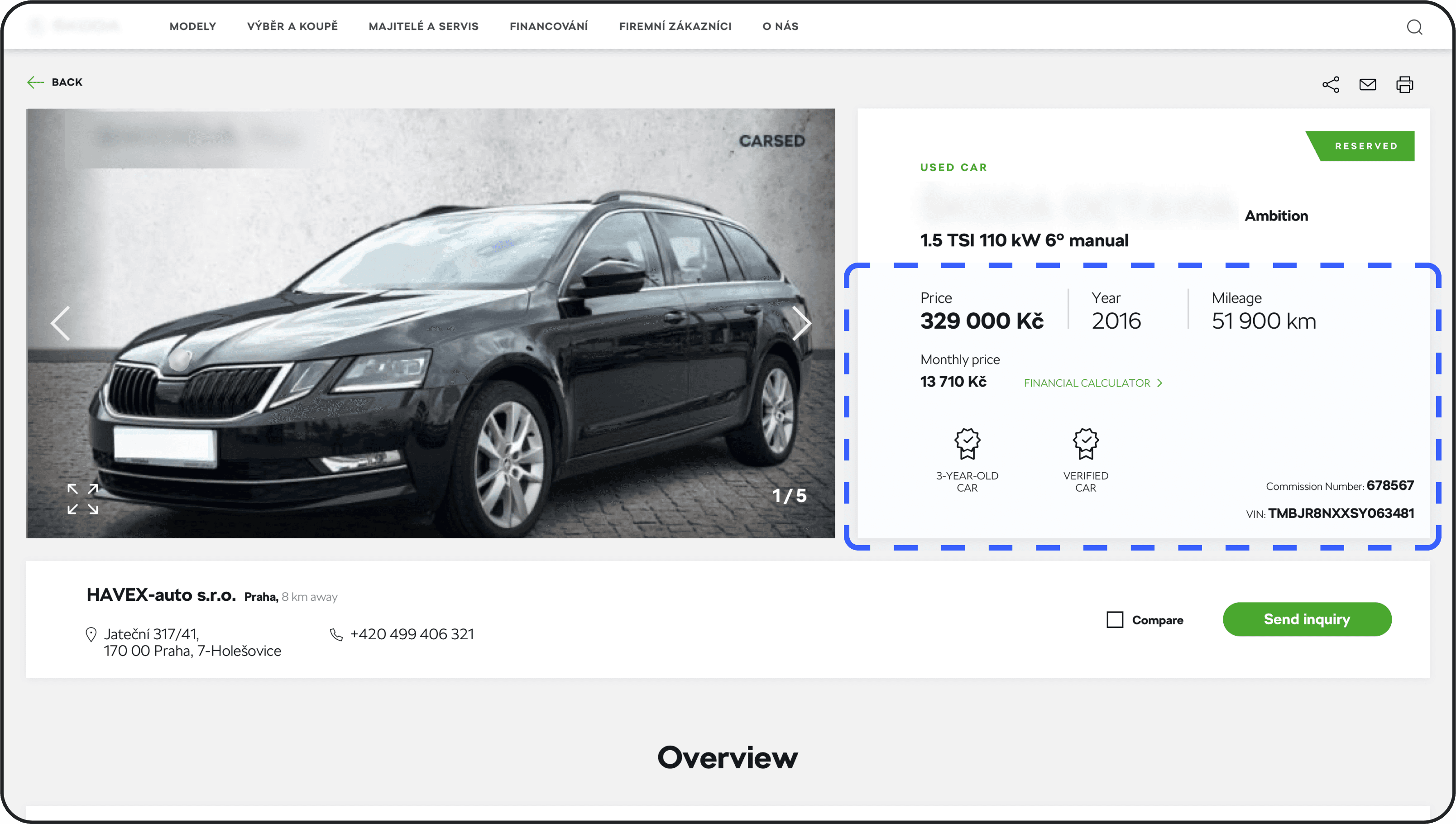
Since test drives were a crucial part of users' decision-making process, we ensured the test drive inquiry CTA and dealer information were placed prominently above the fold, just below the car info overview. This made it easy for users to quickly request a test drive, streamlining their path to experiencing the vehicle firsthand.
Detailed Car Insights
To meet the needs of used car buyers, who required more detailed information, we prioritized showcasing comprehensive details like mileage, VIN number, and car verification status. This allowed users to assess a car's reliability and feel confident in their purchase.
Validation
Once we had the prototype ready, we began preparing for usability testing. A key challenge we faced was the language barrier between the design team—myself (Polish) and a second designer (Turkish)—and the Czech-speaking participants. To overcome this, we partnered with a Prague-based external agency to conduct the tests using our protocol.
The testing focused on three core screens: the homepage, results page, and detail page. The goal was to see if the platform made it easy for users to connect with dealerships while solving some common frustrations.
One issue we uncovered was that 65% of users were unclear on the difference between stock and used cars, which pointed to a need for better messaging. Users also wanted a quicker way to compare cars - 80% found sending multiple inquiries too time-consuming. On the positive side, 75% of participants liked the filtering options, especially when sorting by price, brand, and mileage.
Overall, navigation was a highlight, with 85% of users feeling confident searching for cars on the platform. These insights gave us a clear picture of what was working and what needed fine-tuning, helping us prioritize the next steps.
The Final Product
The final version of the platform was released in 2020 and is still available for users, with a visual update introduced in 2022 to align with the company's new branding.
Personal Learnings
This project really showed me how essential the research and discovery phase is for setting a strong foundation. Spending time upfront to understand user behavior and pain points helped us validate assumptions and guide the design process in the right direction. It reinforced how research-driven insights can uncover issues that might not be obvious at first, like confusion between stock and used cars. Overall, it highlighted the value of thoughtful discovery in building solutions that truly fit user needs and expectations.
